Color matching across different substrates is a complex but essential task in shopfitting. This article outlines the methods and considerations professionals use to achieve visual consistency throughout retail fixtures.
1. Understanding the Core Problem: One Color, Multiple Interpretations
Color is not an absolute value—it is a visual perception influenced by surface texture, gloss, material density, and lighting.
The same color reference (e.g., RAL 7035 or Pantone 430C) may:
- Appear darker on powder-coated metal due to higher reflectivity
- Seem warmer on matte lacquered MDF because of light diffusion
- Shift visually on fabric as fibers absorb and scatter light irregularly
Therefore, color matching in shopfitting is not about applying identical formulas. It is about achieving perceived consistency across material categories.
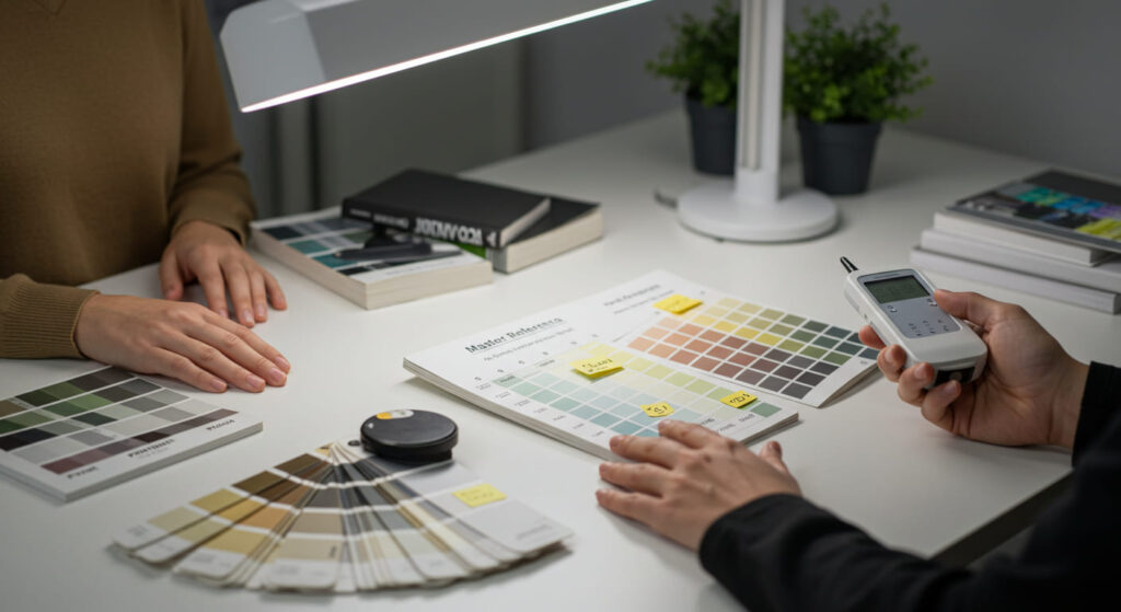
2. Selecting a Master Reference: Where Matching Begins
A successful color matching process begins with the precise definition of a master reference, usually one of the following:
- A Pantone or RAL color code
- A physical coated swatch sample
- A painted component from a previous project
- A client-provided reference under specific lighting
Key practice: Whenever possible, prioritize a physical sample under intended store lighting. Relying solely on digital references can introduce significant deviation due to device display variability.
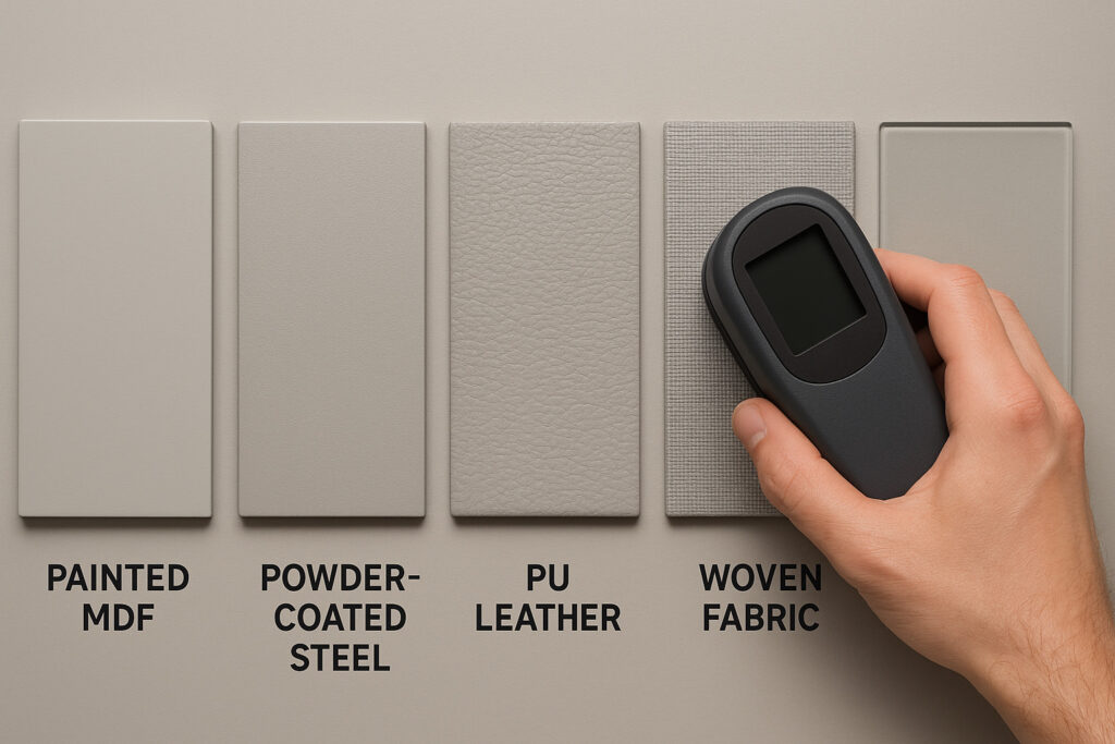
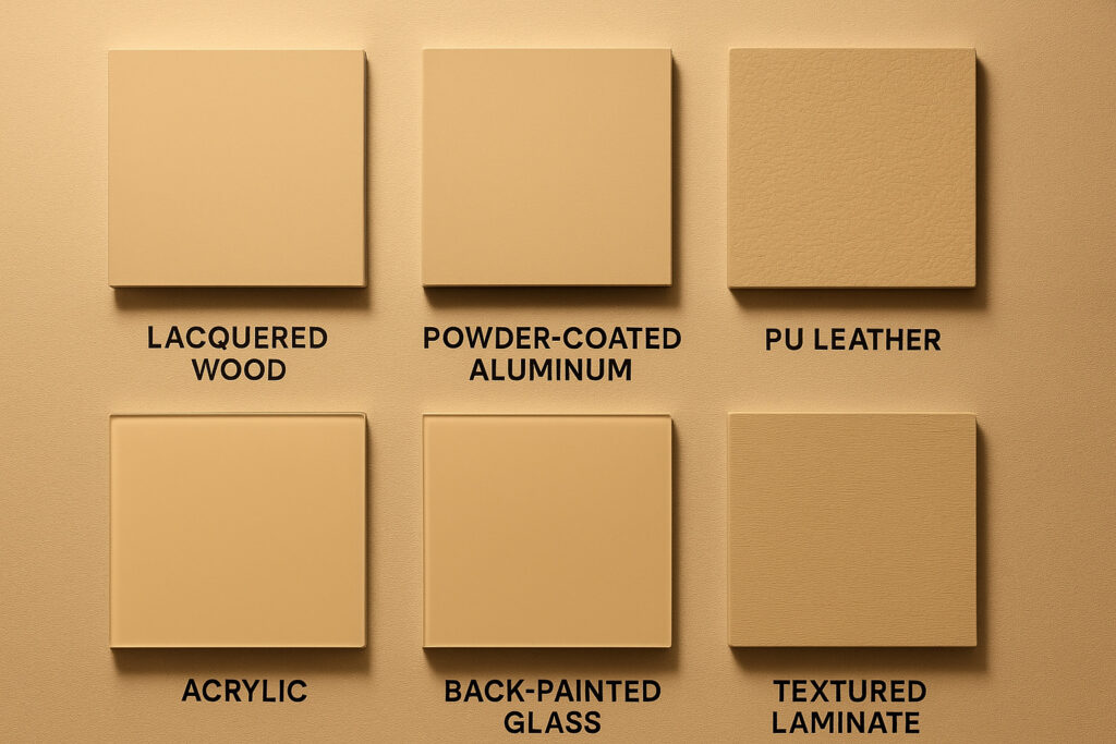
3. The Material Factor: Adapting Per Substrate
Different materials interact with color coatings in distinct ways. Professionals account for these differences by adjusting color formulations per substrate, often as follows:
| Material Type | Matching Methodology |
|---|---|
| MDF / Wood | PU paint or NC lacquer with pigment adjustment for undertones |
| Steel / Aluminum | Powder coating with customized pre-bake color formulation |
| Fabric / Leather | Dye-to-match systems using spectrophotometers and visual verification |
| Glass | Back-painting or film application; requires calibration against light transmission |
| Acrylic | Pre-colored or back-painted with pigment correction for optical clarity |
Each substrate requires independent testing and approval. Cross-surface uniformity is only achievable when each material is treated as a separate color target.
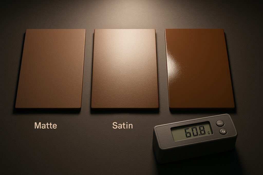
4. Managing Gloss and Surface Texture: A Hidden Variable
Color perception is heavily influenced by gloss level and surface roughness.
- Higher gloss increases reflectivity, making colors appear deeper and more saturated
- Matte finishes scatter light, often resulting in desaturation or a chalky appearance
- Textured surfaces (brushed metal, woven fabric) introduce microshadows that alter color depth
Therefore, gloss level must be standardized and measured—often in gloss units (GU) using a gloss meter. A deviation of more than ±5 GU across components can cause visible inconsistency.
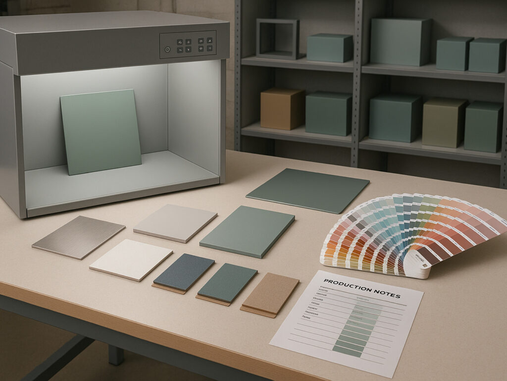
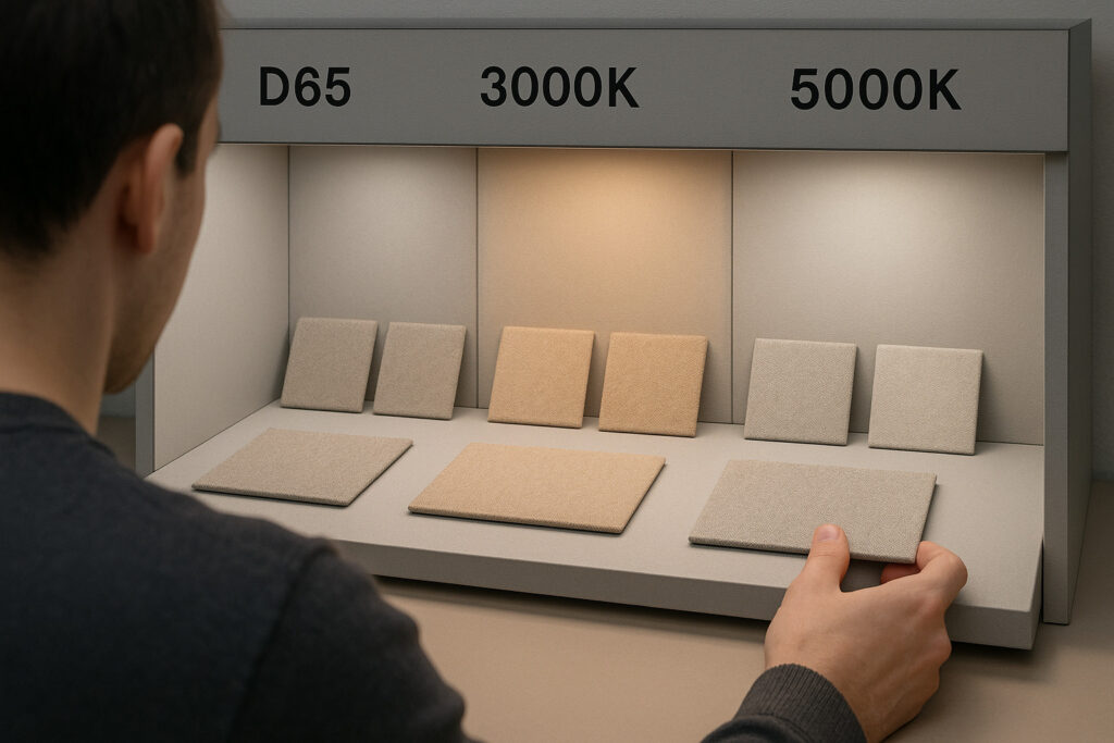
5. Lighting Conditions: The Role of Illumination Temperature
Color matching must be evaluated under controlled and consistent lighting conditions. Common practice includes:
- Testing under D65 lighting (6500K) to simulate daylight
- Cross-checking under store-specific lighting (e.g., 3000K warm LEDs)
- Reviewing samples from multiple angles to account for directional light and shadows
Note: The same sample may appear consistent under daylight but deviate significantly under in-store lighting. Final approvals should always occur under replicated store conditions, preferably within a mock-up environment.
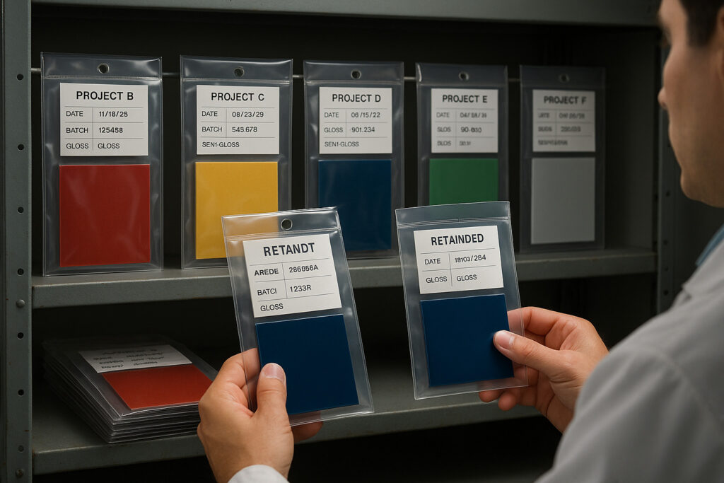
6. Batch Control and Color Drift: Maintaining Consistency Over Time
For multi-phase rollouts or repeated orders, batch consistency is a critical concern. Without controls, minor variations in pigment, substrate absorption, or coating conditions can cause color drift.
To manage this:
- All approved samples are archived as production standards
- Formulations are digitally recorded and linked to supplier batches
- Production is executed under defined tolerance ranges, typically ΔE ≤ 1.5
- Visual inspections supplement instrumental measurements
For critical projects, clients may request a retained control sample for future reference or an on-site color matching session before mass production.
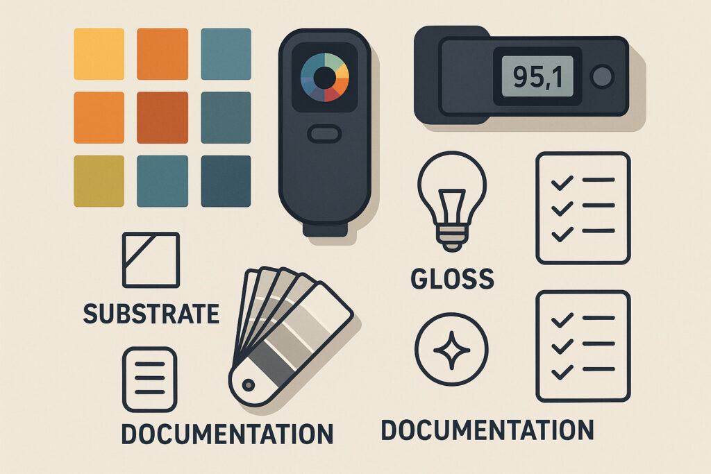
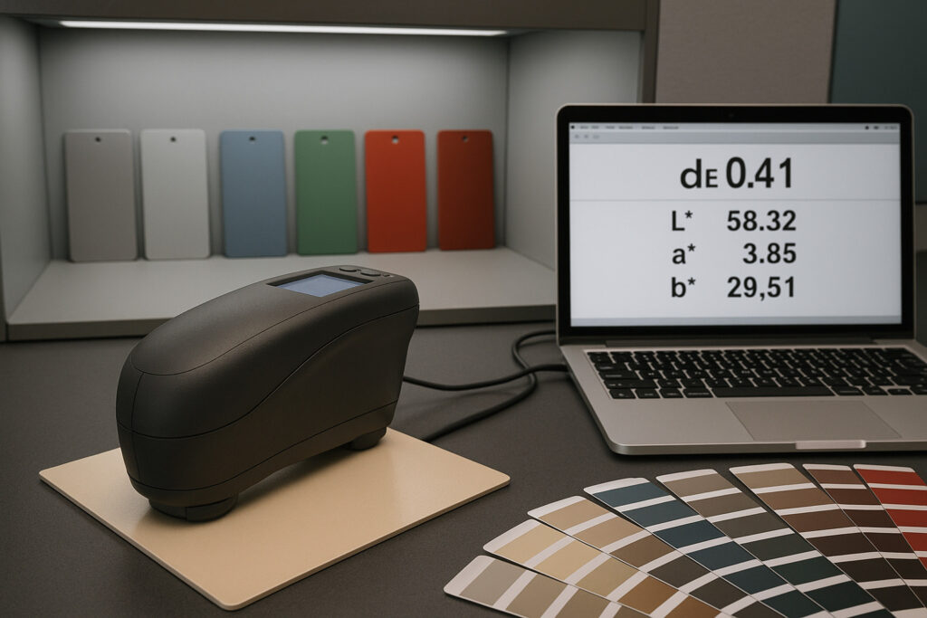
7. The Role of Colorimetric Instruments in Professional Practice
In many projects, visual evaluation alone is insufficient. Advanced shopfitters employ tools such as:
- Spectrophotometers to measure Lab* color coordinates
- Gloss meters to verify surface reflectance values
- Light boxes with multiple color temperatures for standardized assessment
These instruments are used in combination with trained visual evaluation, as instruments may not capture subtle perception differences, especially across diverse materials.
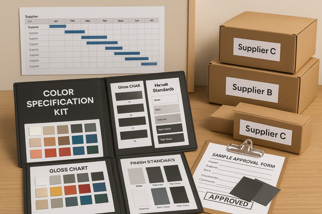
8. Cross-Supplier Coordination: The Importance of Centralized Control
When fixtures are produced across multiple facilities or suppliers, color inconsistencies often arise from lack of unified standards.
To prevent this:
- A central color specification package is issued, including physical swatches, gloss data, finish descriptions, and lighting requirements
- Unified sampling and sign-off procedures are enforced
- Suppliers are required to submit pre-production samples for comparative review
A centralized project manager or technical coordinator often oversees this process to maintain consistency throughout.
9. Summary Table: Key Elements in Professional Color Matching
| Element | Description |
|---|---|
| Reference Definition | Physical sample + coded value |
| Substrate-Specific Formulas | Adjusted per material absorption and surface |
| Gloss Standardization | Defined GU level per component |
| Lighting Simulation | Sample review under store-replicated lighting |
| Instrumental Measurement | Spectrophotometer and gloss meter use |
| Batch Control | Recorded formulas + retained samples |
| Cross-Supplier Communication | Shared specs + enforced sample approval process |
Closing Note
In shopfitting, color matching is not about visual approximation—it’s about controlled precision across variable materials. Achieving it requires systematic sampling, cross-disciplinary knowledge, and close coordination between client, designer, and production.
Understanding these mechanics helps store owners and project managers make informed decisions that maintain brand integrity and visual consistency across all points of sale.