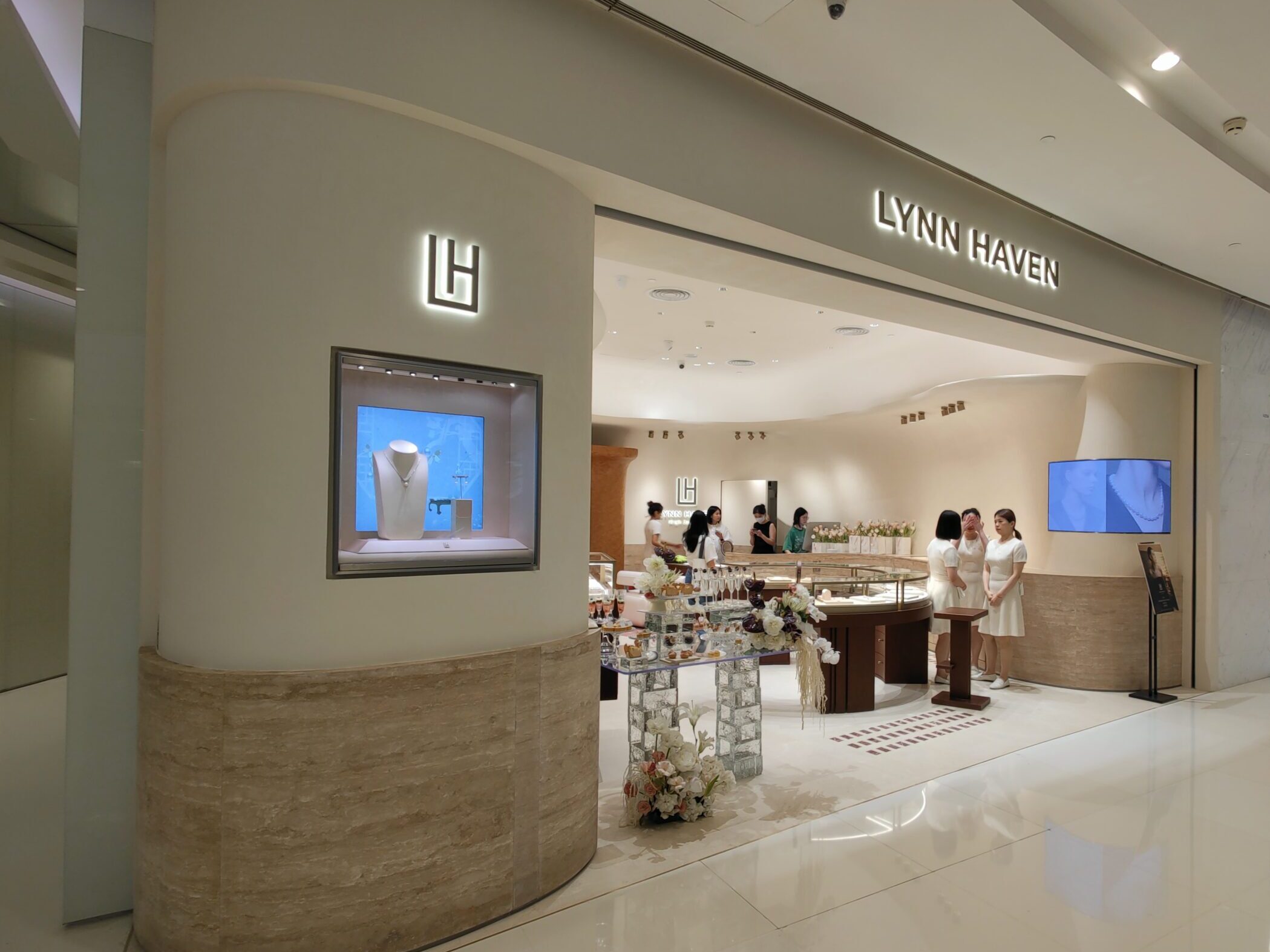
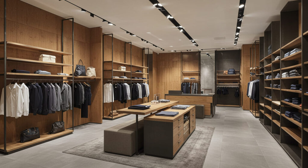
In retail design, form follows function—but it’s material contrast that often leads the eye. As customers enter a store, their visual attention is instantly pulled toward elements that stand out. That’s where material contrast becomes a valuable tool. When applied thoughtfully, the interplay between textures, finishes, and colors does more than look appealing; it establishes a clear visual hierarchy that improves both navigation and engagement.
What is Visual Hierarchy, and Why Does it Matter?
Visual hierarchy refers to the arrangement of design elements that guide the viewer’s eye toward the most important areas first. In a retail setting, this might mean drawing attention to new arrivals, premium products, or brand focal points. While size, color, and lighting all contribute, the materials themselves—how they interact and differ—play an often overlooked but crucial role.
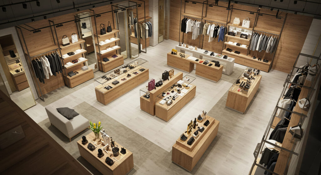
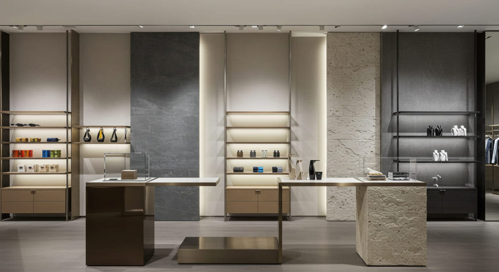
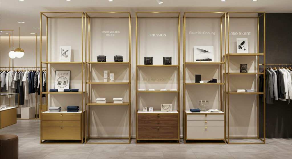
For example, a high-gloss display pedestal surrounded by matte-finished walls will stand out immediately. Likewise, a natural wood element against a background of brushed metal signals warmth and attention, subtly encouraging touch or closer inspection.
Common Material Pairings That Create Contrast
Designing visual hierarchy with material contrast starts with thoughtful pairing. Here are a few widely used combinations:
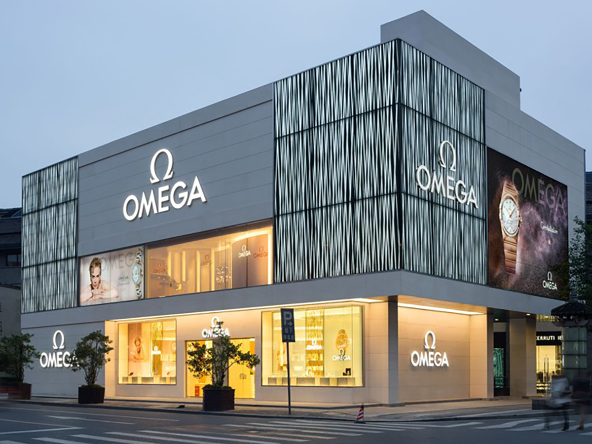
- Matte vs. Gloss: A common and impactful pairing. Glossy surfaces reflect light and attract attention, while matte textures help other materials pop.
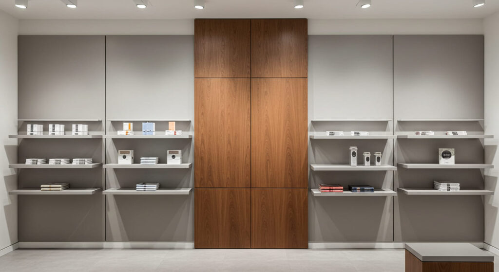
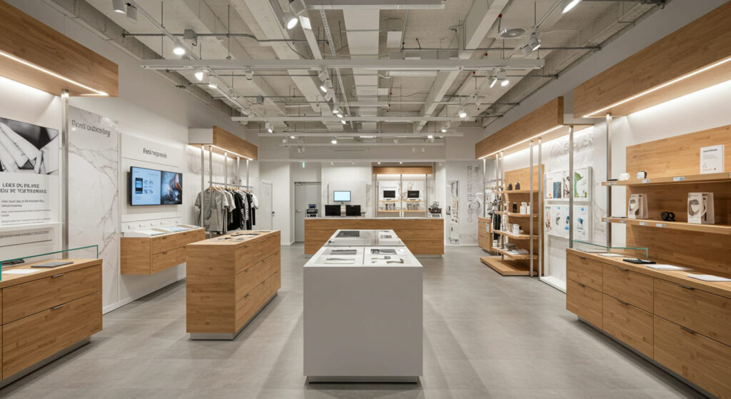
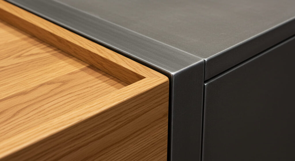
- Wood and Metal: Wood adds warmth and approachability, while metal brings precision and modernity. The contrast of organic and industrial appeals across retail categories.
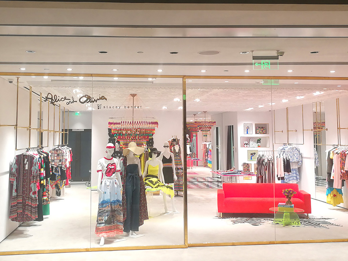
- Textile and Acrylic: Soft fabric textures juxtaposed against sleek acrylic or glass give contrast both in feel and in visual weight, perfect for emphasizing key display sections.
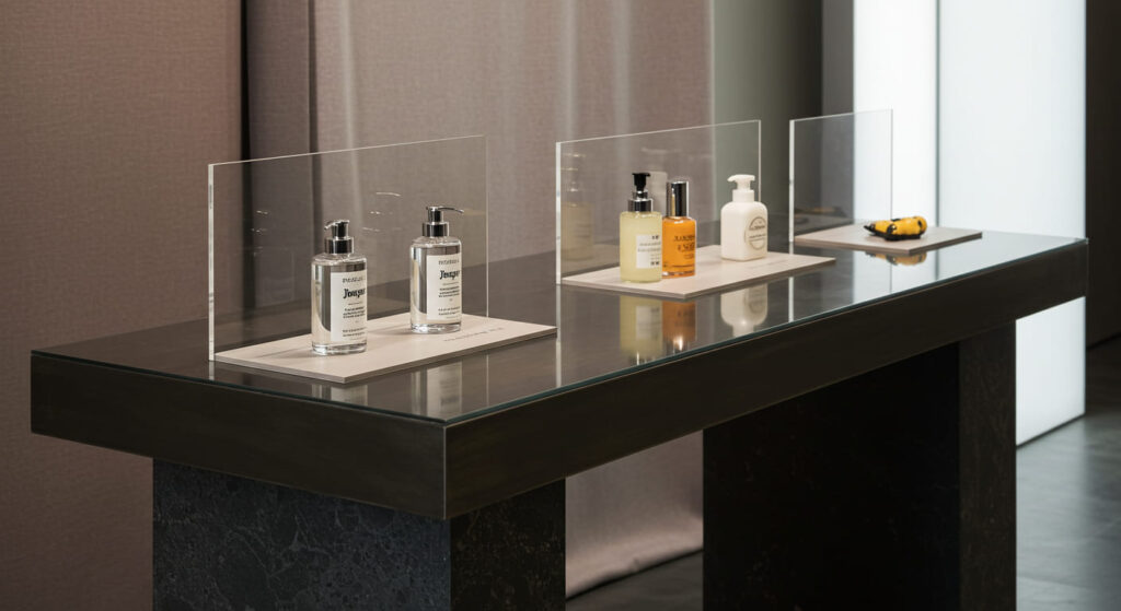
- Transparent vs. Opaque: Layering transparent materials like glass or acrylic with solid elements can create a sense of depth, drawing the eye inward.
Each pairing must be tailored to your brand’s style and the products being showcased. For luxury fashion, subtle contrasts may speak volumes; for tech products, bold contrast might better emphasize innovation and clarity.
Creating Focal Points with Contrast
Visual hierarchy isn’t about overwhelming contrast everywhere—it’s about balance. Strategic use of standout materials can lead a customer’s gaze precisely where it’s intended.
Consider a wall display with a primary shelving unit in dark matte metal. Behind it, a glossy lacquered panel highlights select merchandise, making them feel elevated. Or, within a jewelry display, a velvet-lined drawer with a brushed stainless steel frame instantly focuses attention on the delicate items inside.
Using contrasting materials as a backdrop or framing device can dramatically increase visibility and perceived value of the merchandise without needing extra lighting or signage.
Enhancing User Experience Through Tactile Contrast
Material contrast isn’t just visual—it’s tactile. Customers often engage with products physically, especially in high-touch environments like apparel or cosmetics.
A cold metal fixture housing a warm, natural wood display tray invites users to explore. The shift in texture communicates a transition in function: from supporting structure to primary product focus. This dual-layered interaction—seeing and touching—deepens engagement and improves product recall.
For WeiLin, integrating tactile experience into the material palette helps retailers subtly guide customer behavior without appearing overly engineered.
Considerations in Production and Execution
From a manufacturing standpoint, combining different materials can be challenging. Each material reacts differently during fabrication—some require specific adhesives, others need pre-treatment for durability or visual harmony.
For instance, joining wood to powder-coated steel might require hidden brackets or flexible gaskets to account for expansion. Likewise, integrating acrylic elements into metal displays needs precision bonding to avoid long-term stress cracks or discoloration.
A Tool for Branding and Storytelling
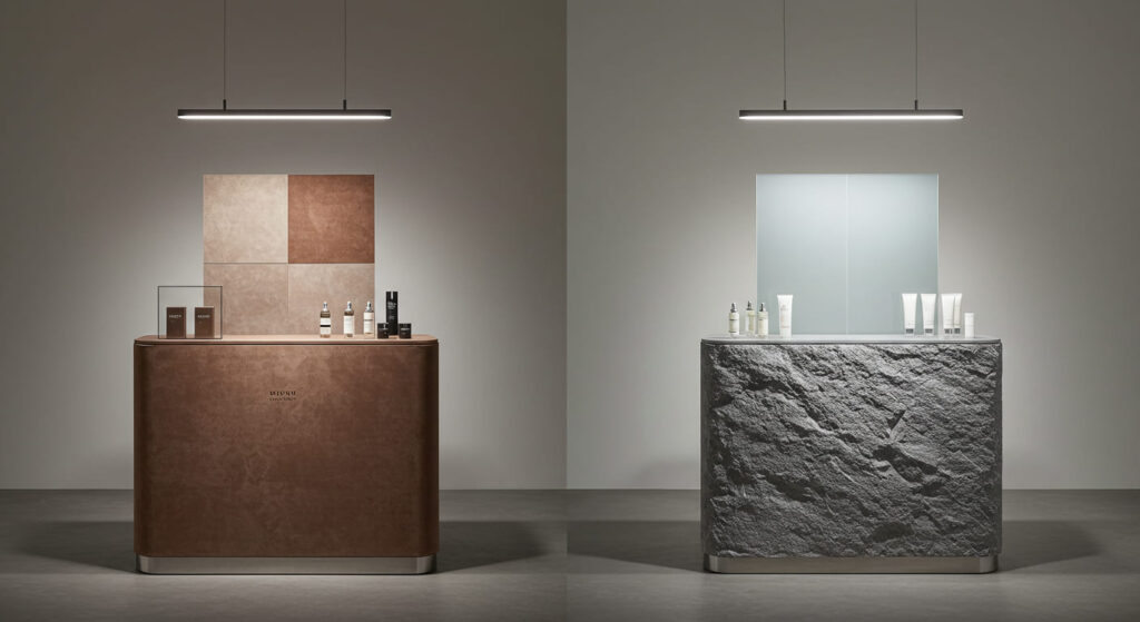
Beyond function, material contrast tells a story. A fashion brand may use soft suede next to polished chrome to emphasize the duality of elegance and boldness. A skincare brand might pair raw stone with frosted glass to underline purity and transparency.
These choices don’t just support the visual hierarchy—they define it. Every surface communicates your brand values, and contrasting materials act as the visual grammar that makes it readable.
Conclusion: Use Contrast with Purpose
Material contrast is not decoration—it’s a strategic design decision that affects how customers interact with your space. When executed thoughtfully, it enhances clarity, adds depth, and increases engagement.
At WeiLin, we believe in designing retail displays that are not only beautiful but also purposeful. Through smart material pairing and precise craftsmanship, we help clients translate their brand identity into powerful visual stories.
If you’re looking to make your retail environment more compelling and intuitive, let’s talk about how material contrast can work for you.